Trader's Page Redesign
Turning a dense trading dashboard into a guided flow for first-time options traders
The brief
Finapolis builds analytics tools for people who already invest. Most of their users know the stock market. Almost none of them have traded options. The Trader page sits inside a bigger platform, alongside Dashboard, Screener, Analyzer, Reporter, and Portfolio, and it's built for trade ideation, not execution. Nothing on the page sends an order.
The client's problem was specific: users open the page and don't know where to start. Competitor tools in this space are dense by tradition, built for people who already know the jargon and want everything visible at once. Finapolis wanted the opposite, something a layperson could work with, without dumbing down what's underneath.
The deliverable: a redesign of the Trader page only, handed over as a Figma file for their team's review.
Reading the existing page
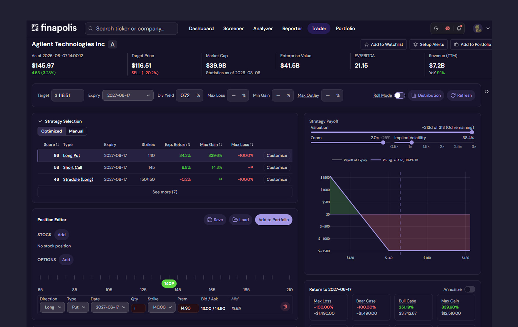
The original layout packed five functional blocks onto one screen: a filter bar, a ranked strategy table, a payoff chart, a manual position editor, and a returns panel. Every block used the same border and the same type scale. Nothing signaled where to look first.
The page also hid two mechanics that matter. Filters controlled which strategies showed up in the table. Clicking a row in the table redrew the payoff chart. Neither connection showed up anywhere visually. A first-time trader had no reason to know the chart was reacting to anything they'd clicked.
Three problems fell out of that audit:
- No hierarchy: five equal-weight boxes give a beginner nowhere obvious to start.
- Invisible causality: row selection drives the chart, but nothing on screen says so.
- Unexplained jargon: "Score," "Roll Mode," "Max Outlay," and raw IV percentages sit on the page with zero context.
Information architecture, before any visual design
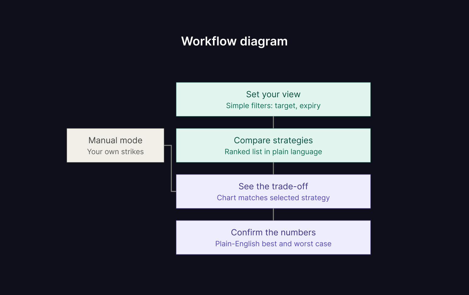
Before touching layout or color, I mapped the page as a sequence instead of a dashboard. Four steps: set your view, compare strategies, see the trade-off, confirm the numbers. Manual position building sits outside that sequence entirely, an optional branch that still feeds the same chart but reads as secondary from the start.
That sequence became the spine for everything after it: which panel shows at a glance, which one gets to stay collapsed, and which fields show up before a user has to ask for them.
Two states that matter most
A first-time visitor and a returning trader need different pages. I designed for both.
Before any filters are set
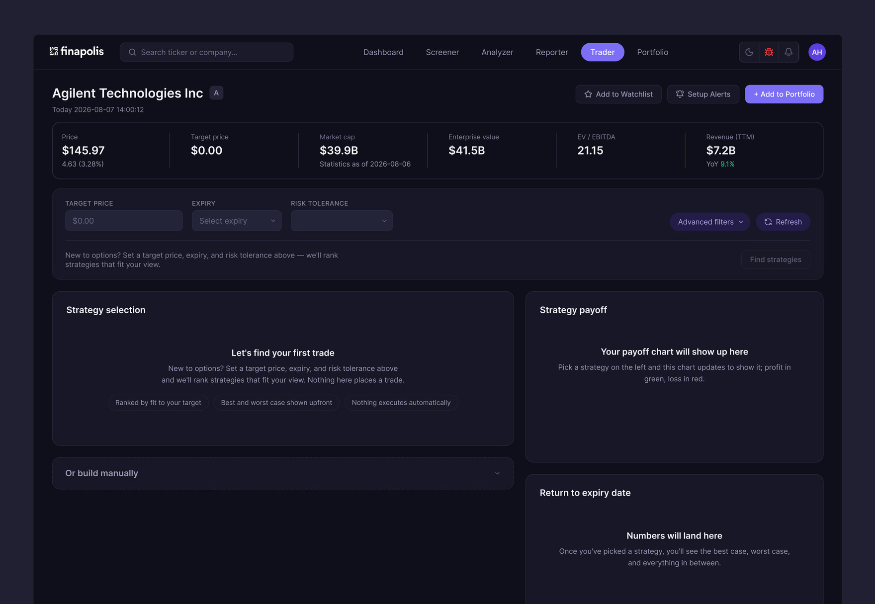
The client's own brief named the real problem: people land here and don't know where to start. So this state starts empty on purpose. Target price, expiry, and risk tolerance sit unfilled. One line of copy answers the obvious question: set these three fields and we'll rank strategies that fit your view. A single button, "Find strategies," stays visibly disabled until all three fields are complete. Exactly one interactive thing competes for attention.
The strategy table, chart, and returns panel show quiet placeholder states instead of empty tables or stale numbers. Each one names what it'll do once it has something to work with. The manual position editor stays open the whole time, since a trader who already knows their strike shouldn't have to fight the guided flow to reach it.
After a strategy is selected
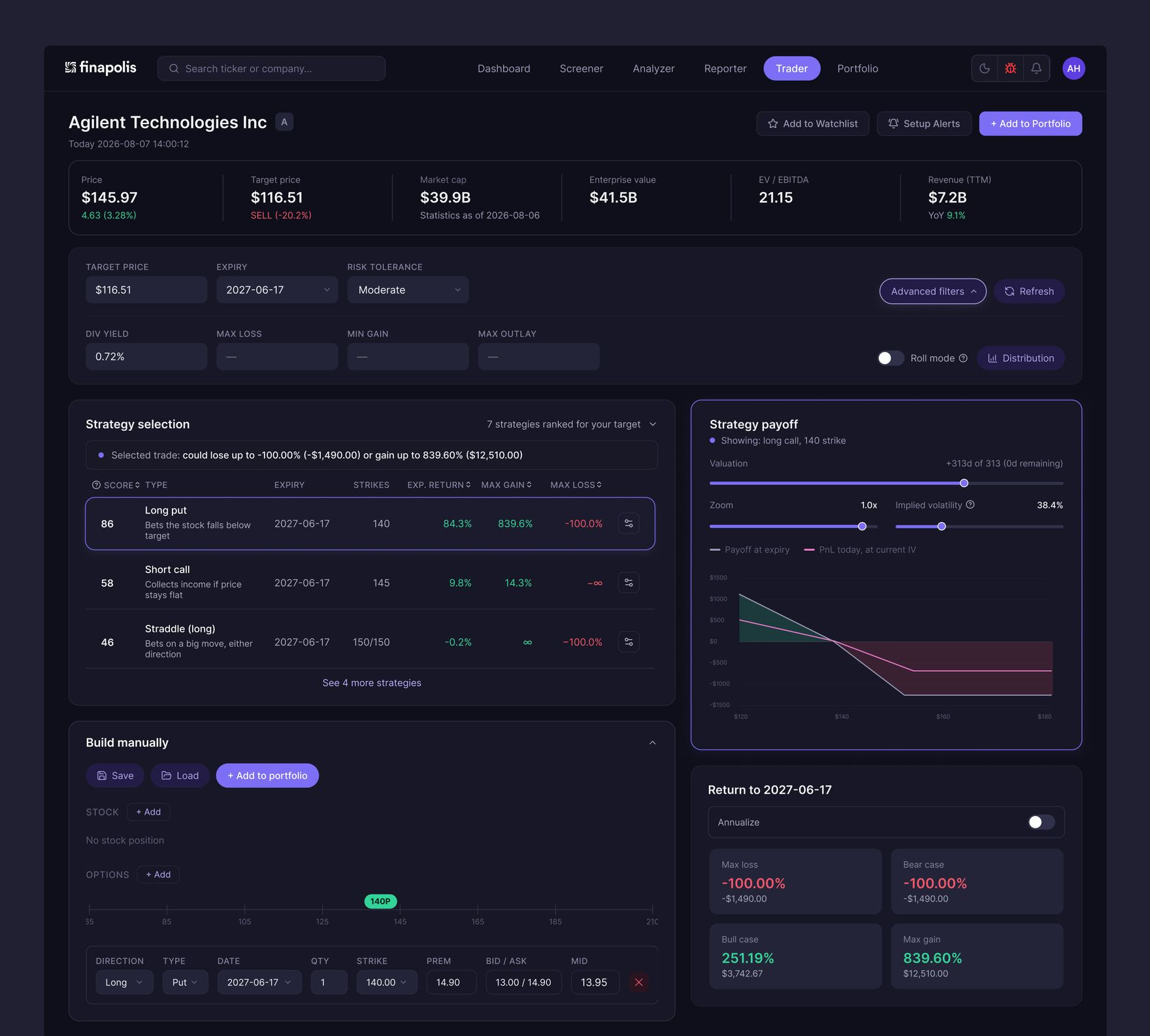
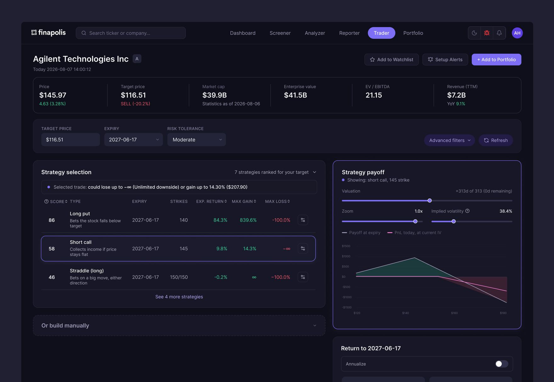
Once filters are set and a strategy is picked, the causality problem gets solved directly. The chart's own header names the selected strategy. Its border and badge shift from neutral gray to the same accent color as the selected row. A slim strip above the table states the stakes in plain language before anyone views the returns panel: what the trade could lose, what it could gain.
The filter bar got the same treatment as the rest of the page. Target price, expiry, and risk tolerance stay visible by default. Div yield, max loss, min gain, and Roll Mode move behind an "Advanced filters" toggle, so a beginner sees three fields instead of eight. The jargon that survived the cut, Score, Implied Volatility, Roll Mode, gets a one-line tooltip on hover instead of speaking for itself.
The manual position editor, previously given the same visual weight as the guided table, moved below it into a dashed, muted card. Still one click away. No longer competing with the primary path for attention.
The prototype in motion
Static frames can't show whether an interaction holds together once someone starts clicking through it. So, the Figma file itself is wired as an interactive prototype: filters gate the "Find strategies" button, rows swap the chart on click, etcetera. The video above walks through that flow end to end.
What changed
- One entry point instead of five: a five-block dashboard became a four-step sequence with a single clear starting field.
- Visible causality: row selection now drives the chart directly, instead of a dependency nobody could see.
- Stakes near the decision: the numbers a trade could produce show up near the decision point, not buried at the bottom of the page.
- Three fields instead of eight: the rest of the filter set moved behind an advanced toggle, available on request.
- A real starting point for beginners: a first-time visitor gets an empty page with one clear next action, instead of eight fields and a wall of numbers.
- The advanced path stayed intact: the manual builder for experienced traders stayed fully functional, just demoted to match how often it gets used.