Studio Website Redesign
Turning a static agency site into an app-like product
A dev studio whose own site didn't look like its work
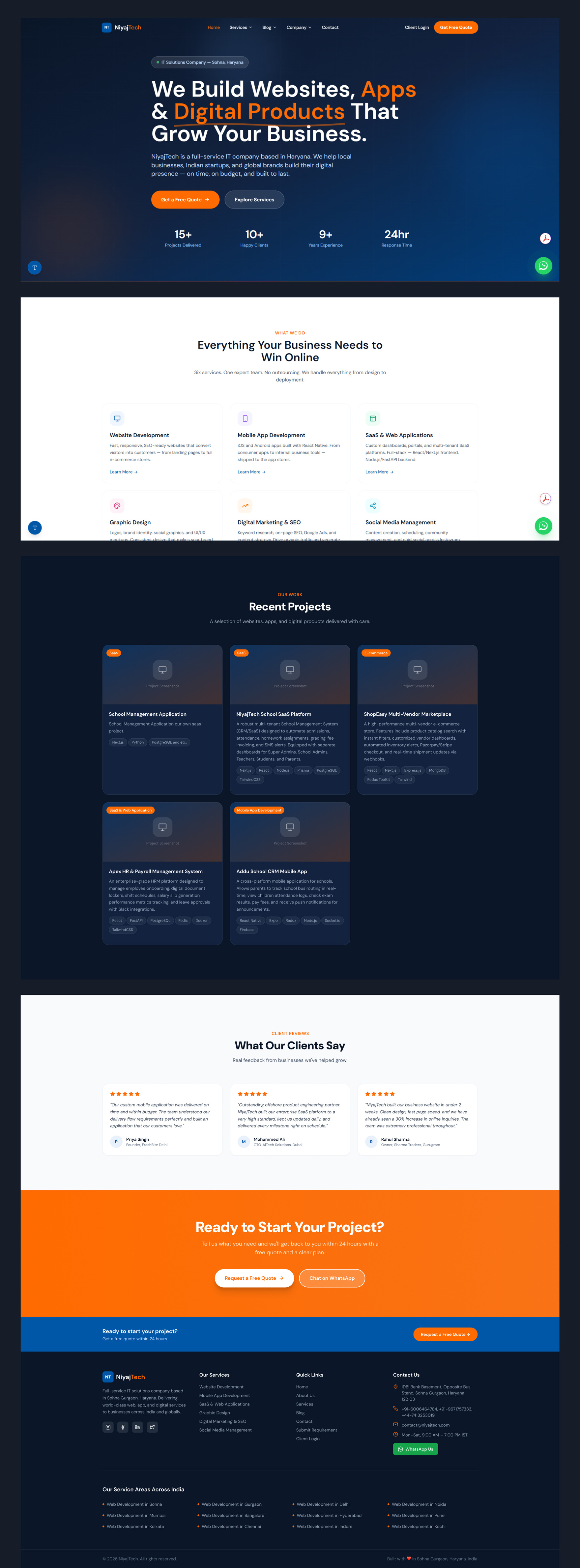
NiyajTech is a full-stack studio based in Sohna, Haryana, building websites, mobile apps, and SaaS platforms for clients across India and abroad. The team ships modern product work: React and Next.js front ends, FastAPI and Node back ends, real SaaS dashboards for real clients.
Their site didn't say any of that. It read as a static, template-driven agency page, the kind that could belong to any local IT vendor. The brief was direct: rebuild it with a modern, app-like feel, SaaS-grade UI, real motion, a proper design system, and both dark and light modes, in Figma with organized components.
Five problems working against them
- No visual proof of capability: a studio that builds SaaS dashboards was represented by a static, non-interactive page.
- Generic agency template feel: stacked sections, stock layout patterns, nothing that signaled a specific point of view.
- Zero motion or micro-interaction: every competitor in the SaaS-agency space now leads with product-style polish. This site had none of it.
- Services listed, not demonstrated: six services as plain text blocks, with no sense of what the actual output looks like.
- No reusable system: no component library, no tokens, nothing a team could reuse to build new pages.
Prototype in code first, then formalize in Figma
I built the homepage directly in HTML, CSS, and JavaScript before opening Figma. For a site whose entire pitch is motion and interaction, static frames hide the motion that needs approval. I could check every animation, hover state, and transition in a real browser before locking any component into a design file.
Direction came from two references the client liked, DesignMe and Primora, both dark, technical, SaaS-product aesthetics. I pulled the confidence and restraint from those, then built a signature move specific to NiyajTech: a live build-log terminal in the hero that "deploys" their actual project names, tying the visual identity directly to the fact that they ship.
Once the homepage held up across breakpoints and interaction states, I rebuilt the whole system in Figma as a componentized, token-based library the client's team can extend into the remaining pages.
Five decisions that carry the whole redesign
A build log instead of a hero graphic
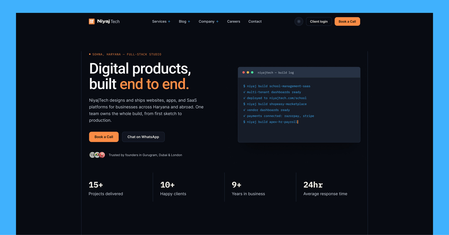
The hero doesn't illustrate "we ship software," it performs it. A terminal window types out real deploy commands using the studio's actual project names, ending on a status line reading "team: 1, outsourced: 0, on time: 15/15." It's literal proof of the "one team, no outsourcing" pitch.
Six services, six working demos
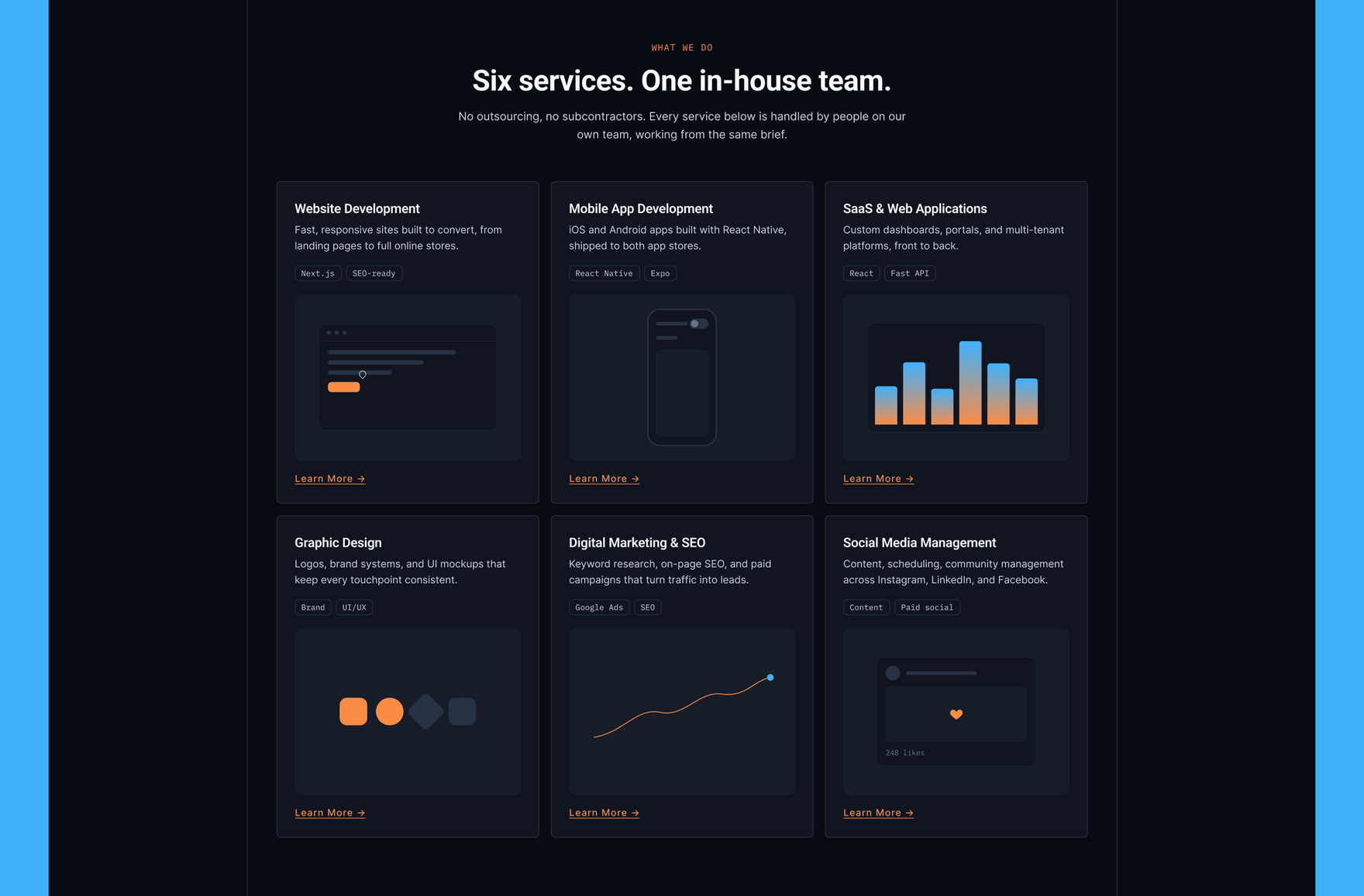
Each service card ends in a live micro-interaction built from that service's actual output: a cursor clicking through a browser mockup for web development, a toggle flipping on a phone frame for mobile, dashboard bars growing for SaaS, a palette cycling for design, a line chart drawing itself for marketing, a like button popping for social. Each card demonstrates its service in action.
Case studies that are actually the product
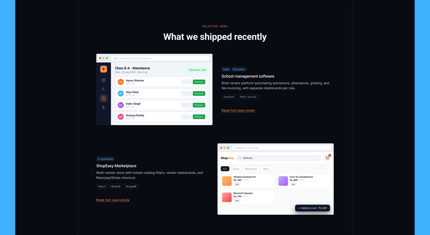
The portfolio section doesn't use screenshots or placeholder mockups. Each of the four featured projects is rebuilt as a real, animated product UI: a school attendance dashboard that marks students present one by one, a storefront that searches and adds to cart, a payroll run that pays four employees and totals the disbursement, and a live bus-tracking app with a countdown ETA and a push alert. Every one runs on real Indian data and genuine product logic.
One system, two themes
Every color, radius, and type style routes through CSS custom properties, so the whole site flips between dark and light mode from a single toggle in the header, running off one shared markup and CSS source.
Other sections
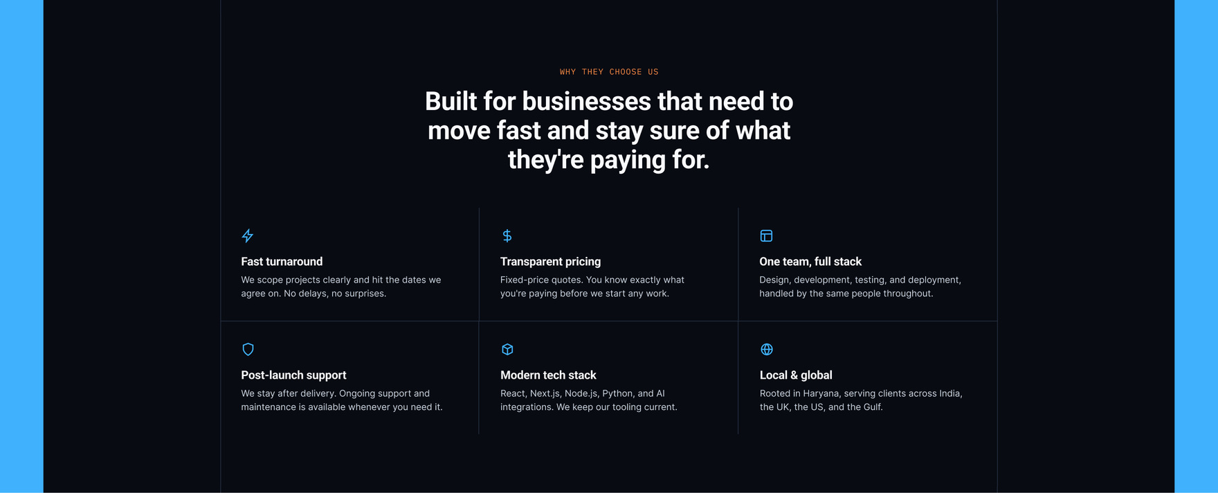
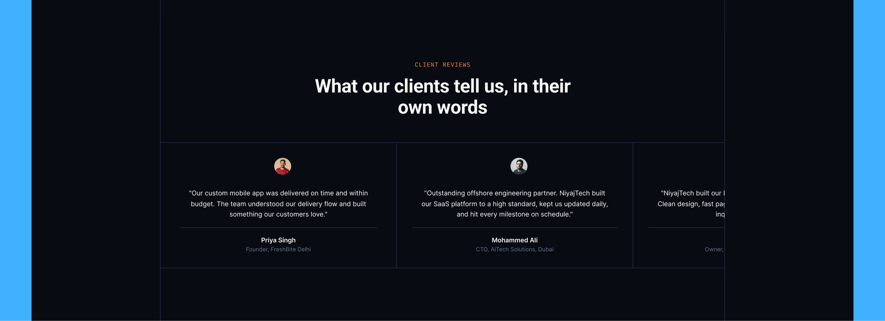
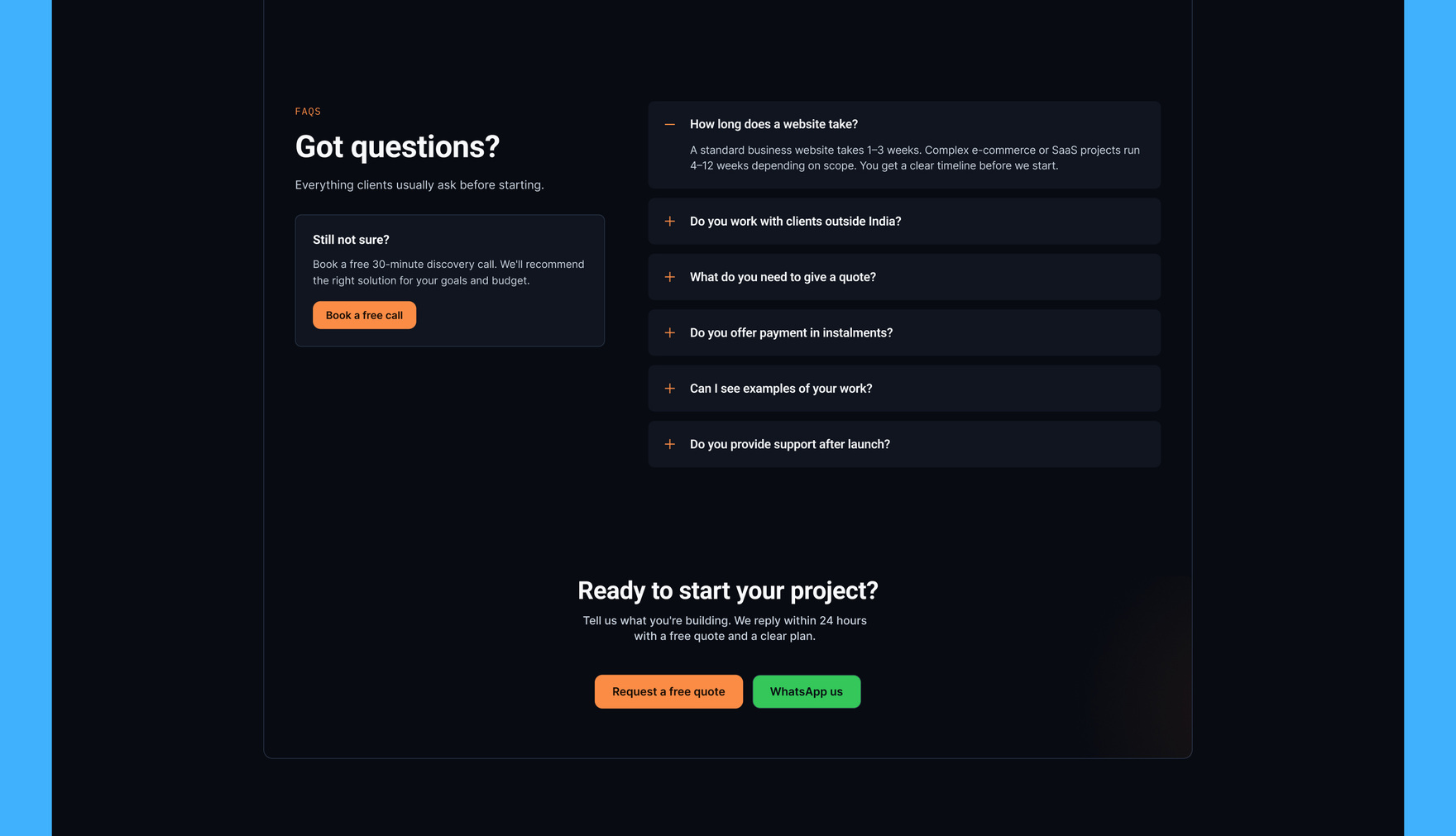
A footer with a job to do
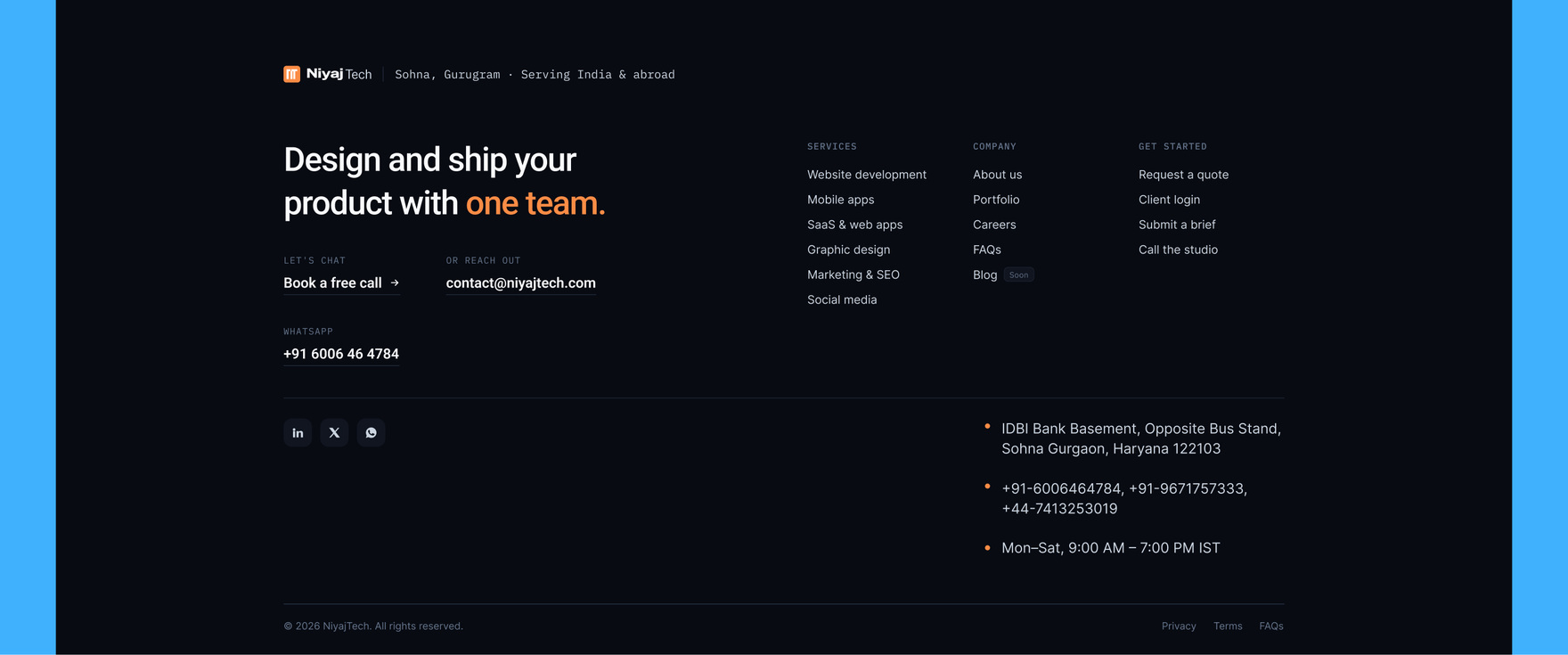
The footer leads with a direct statement and three labeled contact actions, backed by real studio details: address, phone numbers, hours. It closes the page the way a good landing page should, with an obvious next step.
Learnings
- Code first, catches more: prototyping the interactions in code first caught motion problems that a static Figma frame would have hidden.
- Real UI over illustration: building the portfolio mockups as real, working UI took longer than illustrative placeholders would have. It shows the studio's actual capability.
- Tokens early, extend later: planning the dark and light tokens from the first line of CSS made the whole system trivial to extend later.